ABOUT ME
Hello!
My name is Preston, and I work as a data analyst Washington State. Thanks for checking out my website!
I currently work in the healthcare industry and am happy to have recently graduated from Georgia Tech’s MS Analytics (OMSA) program. Through my work and studies I’ve gained a plethora of experience in the full stack of data analysis, from processing and querying to visualization. Feel free to check out some of my projects below.
In my free time, I enjoy watching and playing soccer (Go Barca! Go Sounders!), hiking and camping around Washington, re-watching The Office, and playing videogames with my friends.
Programming Languages
Python
R
SQL
JavaScript
HTML5
CSS3
Software & BI
Excel
Tableau
Power BI
PowerPoint
QGIS
PROJECTS
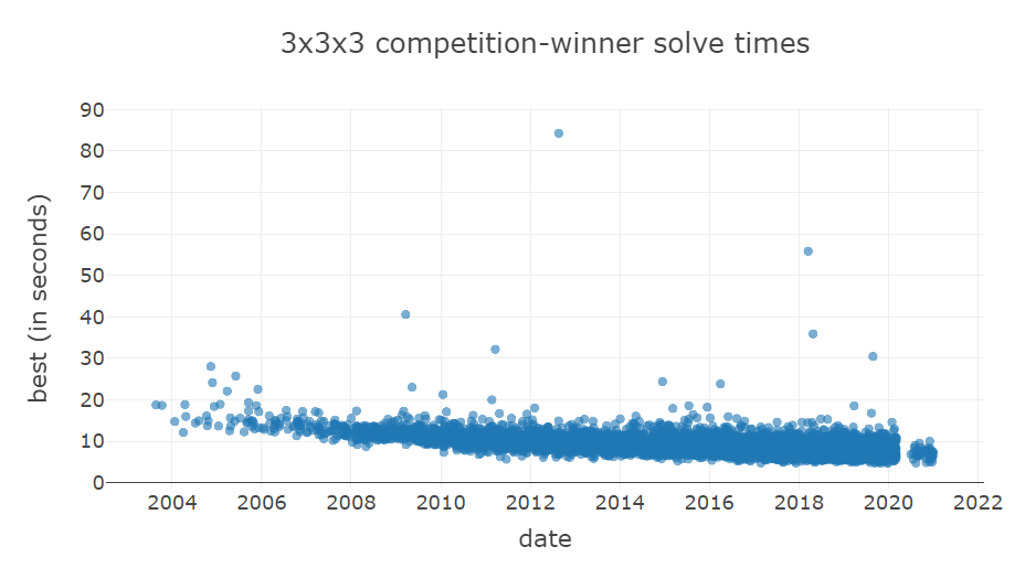
Rubik's Cube Competitions Analysis
Overview:
Analysis project focusing on the World Cube Association's database - queried extensively with SQL. Light analysis of several database facets, put together in a Jupyter Notebook
Tools Used:
SQL, Python, Jupyter Notebook
Repository:
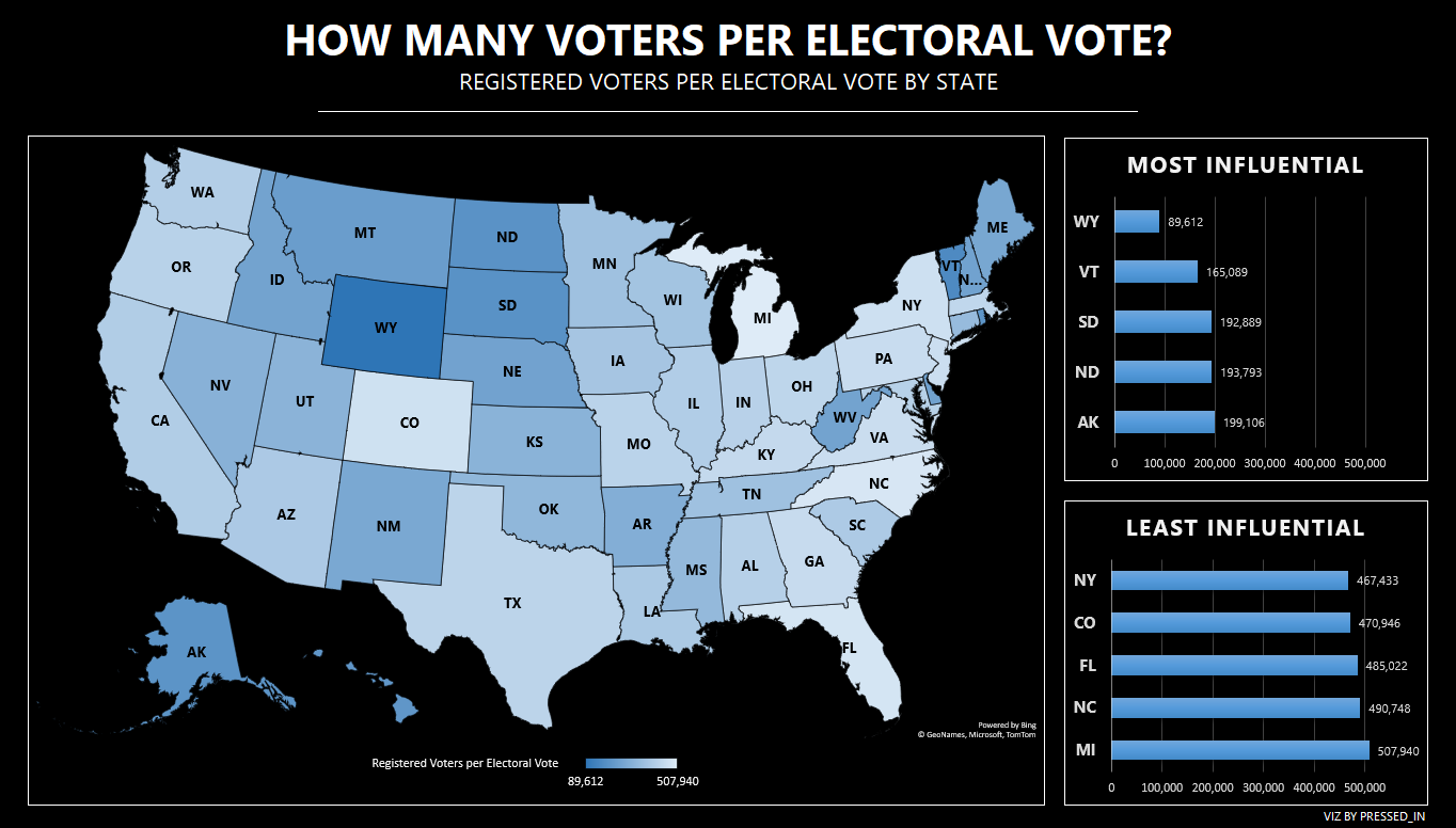
Electoral College Visualized
Overview:
Visualization produced by Excel highlighting relative voter weight by state as of November 2020. Involved data manipulation and analysis in Excel (pivot tables) as well as advanced styling techniques.
Tools Used:
Excel
Repository:
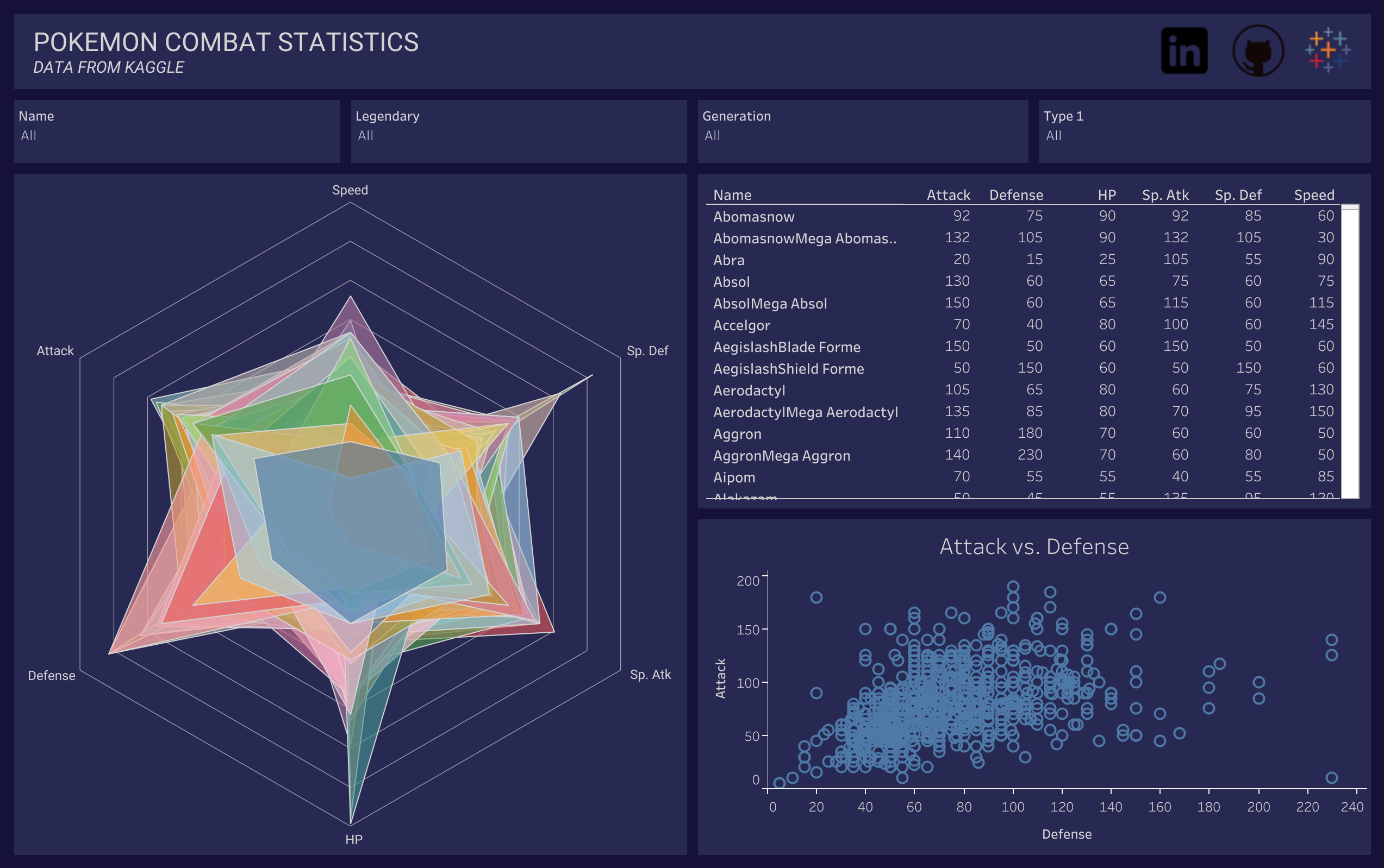
Pokémon Dashboard
Overview:
Tableau Public dashboard made with data from the a Pokémon dataset hosted on Kaggle. Involved data manipulation in Excel and Tableau charting.
Tools Used:
Excel, Tableau Public
Repository:
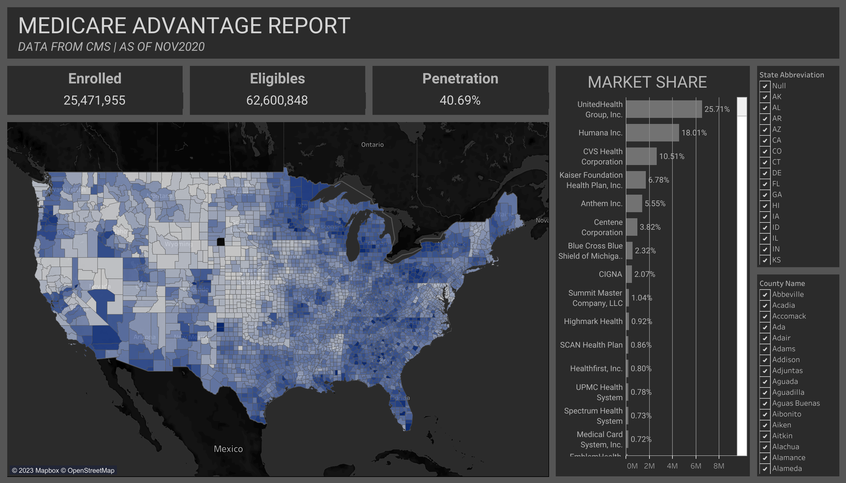
Medicare Advantage Report
Overview:
Tableau Public dashboard made with several sources of csv data from cms.gov. Involves cleaning data & manipulating tables in Excel, joining tables and setting relationships in Tableau, and advanced knowledge of various Tableau charts.
Tools Used:
Microsoft Excel, Tableau Public
Repository:
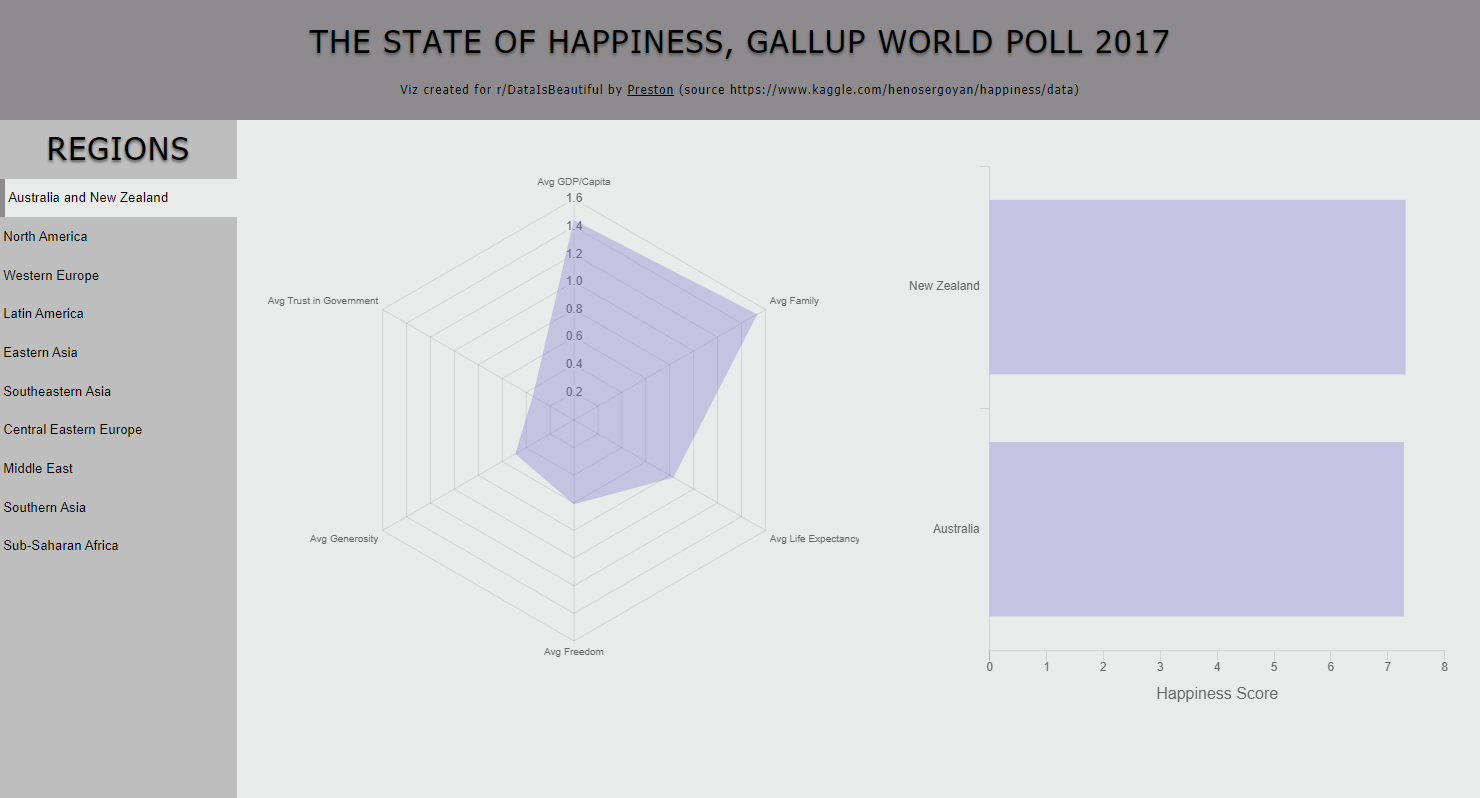
Gallup World Happiness - 2017
Overview:
Interactive dashboard displaying 'happiness' information from world countries, based on the Gallup 2017 World Poll. Excel, Javascript, Chart.JS, and HTML/CSS were used to analyze, visualize, and host the dashboard.
Tools Used:
Python, Dash, HTML/CSS, Heroku
Repository: